Design for Developers
Audio
DownloadVideo
Watch on YouTubeTalk description
If you've ever wanted to learn more about the magical secrets of UI design (trust me, they're no secret at all!), get ready for a tour of fundamental design principles, the building blocks of a successful design and how we put that all together to create something beautiful!
Session Summary
If you're a developer who keeps ending up doing the design work, this is the twenty-minute crash course you've been missing. Lex names exactly the moves developers fluff — line height too tight, paragraph spacing before and after headings the wrong way round, Yes/No buttons where Delete/Cancel belongs, photos cropped by the frame instead of the subject — and ties each one back to four anchor principles: hierarchy, proximity, contrast, balance. She hands over working type pairings, a three-tier colour system and a focal-point rule, then closes with four before-and-after refactors that turn design from magic into muscle memory.
View detailed generated session topics, quotes and video timestamps
Who this talk is for (0m30s)
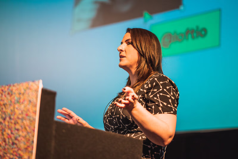
Lex Lofthouse, a designer at Nottingham agency Nzime, opens by setting expectations: this is short, practical UI-design tips for the developers who've ended up doing the design work — no code tips because, as she says, I don't know shit about code, really.
"this isn't gonna be everything I know, and I also won't be giving any code-based tips because, believe me, I don't know shit about code, really"
"whether you are a developer or a designer, a combination of both or something else entirely, hopefully there's something in here that's helpful for you"
"I'm gonna cover some principles of design, tips around different design elements, and then some before-and-after screens"
Four design principles (2m04s)
The anchors: hierarchy (scale signals importance — H1, H2, H3 mirrored visually), proximity (things that belong together sit together, things that don't, don't), contrast (oppose colours, scales or styles to create emphasis), and balance (symmetric for harmony, asymmetric to lead the eye while still feeling balanced).
"good design will visually indicate to you that clear hierarchy of content"
"the distance or the lack of distance between objects helps humans decide what things belong together"
"all these principles kind of mix together a little bit"
Typography: pick a font pair (6m46s)
Start with easy mode — one heading font and one body font. Heading fonts can be brave and embody the brand's tone (a historic font for Nottingham Castle, a bold sans for a modern art gallery, a handwritten font for a kids' trampoline park); body fonts must be safe, simple and readable at small sizes. fontjoy.com generates pairings in-browser.
"fonts, especially that heading font, should either embody the brand or complement the tone and style of the brand"
"headings can be quite bold... you've got an opportunity to be braver with headings"
"fontjoy.com... you can randomly generate font matches, and it does headings, subheadings and paragraph styles"
Spacing: line height and paragraph spacing (11m58s)
The thing developers most consistently get wrong: line height is too tight by default and paragraph spacing collapses gaps that should signal structure. The rule of thumb is that the gap before a heading (separating sections) should be visibly larger than the gap after a heading (which belongs to its paragraph).
"this is probably the most overlooked detail by developers, and I'm really sorry, but it is"
"you could fit a bus through those lines"
"the spacing between the heading and its paragraph should be about the same... and the spacing before the next heading should be larger"
Colour palettes (15m33s)
Start with one brand colour. Build three palettes from it: a small main palette (three colours, including high-contrast pairs), a larger supporting palette for illustration and accents, and a set of neutrals for flexibility. Uber's black/white/blue → secondary illustration colours → neutrals is the worked example.
"start with the main colour that you want to associate with the brand"
"Adobe Colours... you can pick complementary colours, monochromatic shades and everything from there"
"as a designer, picking colours is the lowest bar to meet [for accessibility], so do make sure that you are checking for colour contrast there"
Imagery: focal points and treatments (20m38s)
The most common photo mistake: cropping by the frame instead of the subject. Make sure the subject of the photo is positioned where any container will keep it visible — and use a consistent image treatment (black-and-white, duotone, cutout) when your source photos came from many different cameras and locations.
"we just need to consider the frame that our image is gonna sit in first"
"diamonds and circles are a bit trickier when it comes to the focal point because they crop out a lot more"
"Unsplash is a great resource — they have quite a wide range of images and they don't all fall into the trap of the cheesy meme"
Icons: label them if not universal (23m43s)
A magnifying glass means search, three lines means menu, a trash can means delete — those three are universal. A heart could mean like, favourite or follow; a rectangle with an arrow could mean share, repost or export. Label anything that isn't universal.
"with icons, it's really easy when we're creating a design to assume that the user knows what they mean just because we do"
"if it's not immediately obvious what they do, giving them a label will make that a hell of a lot easier for the user"
"fontawesome.com... they have a huge amount of icons, vector and font formats, so they never lose fidelity"
Layout: grids and atomic design (25m45s)
The 12-column grid divides cleanly into 2, 3, 4 and 6, which is why it suits responsive design. Brad Frost's atomic design vocabulary then layers on top: atoms (image, title, price), molecules (those atoms combined into a card), organisms (multiple cards combined into a grid section), pages and templates. The practical use: if a whole page is overwhelming, start with atoms and build up.
"a 12 column grid... is divisible by 2, 3, 4 and 6 — this makes it really versatile for responsive design"
"atomic design is a framework... going from atoms to molecules to organisms"
"if you're getting really overwhelmed by creating an entire page, break it down, start really small"
Before-and-after refinements (30m56s)
Four worked refactors of common UI components: a property-listing card (raise the price, declutter spec, group contact details, fix gallery affordance), a confirmation dialog (put the warning at the top with an icon, label the buttons Delete and Cancel instead of Yes/No, contrast the primary action), a data-plan radio chooser (boost the differentiator, use blocks instead of radios, show a clear selected state), and a hero section (frame the image so the cat is visible, use high-contrast text, use button hierarchy).
"we've identified [the price] as the key element we want to pull out... so that's the biggest bit of information"
"yes and no kind of makes sense, but let's really make it clear to the user what action they're gonna take — they're gonna delete or cancel"
"I can't see the cat, and that's really important to me"